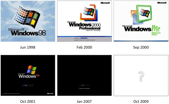
Primary user research showed that most users know that they are running Windows (and what version) via the boot screen. This is a key branding element of the operating system and we wanted to give it the right facelift for Windows 7. The evolution of our past designs became increasingly minimal, and Vista’s boot screen (Jan 2007) removed the visual Windows brand element altogether:
The journey began with sketching the ideal boot sequence. We were looking for something that represented the Windows 7 personality of “light and energy”, while still feeling fast and fluid to users.
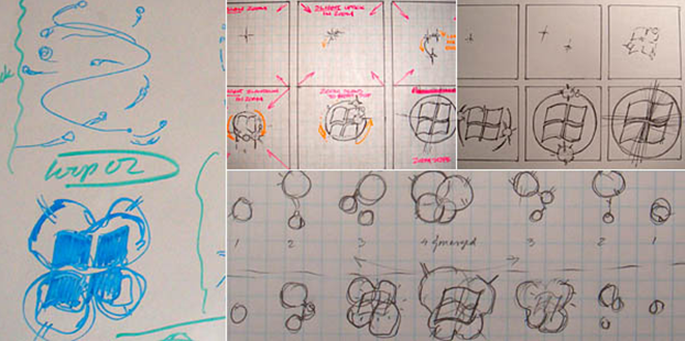
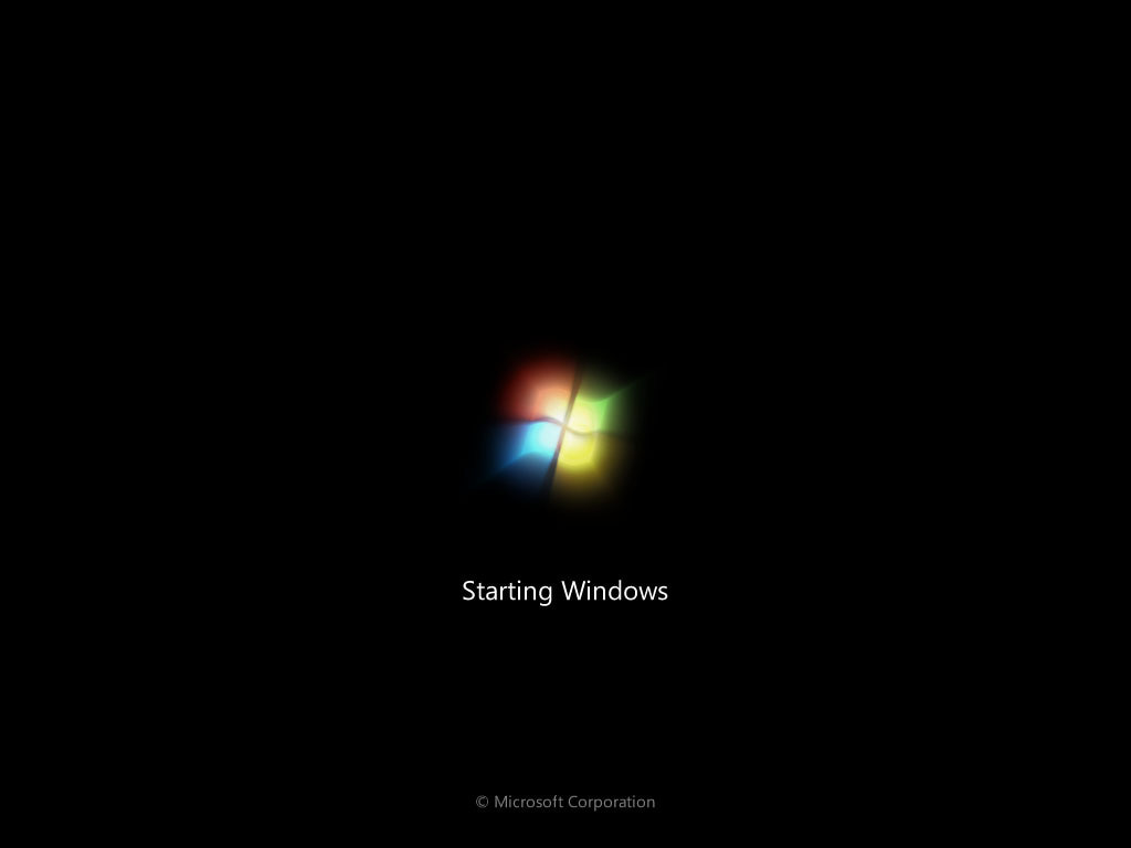
The final design showed energy approaching from four directions, joining to form a light that projected through a window (of course it is no coincidence that the Windows logo resembles a window!). A subtle pulse was used to represent remaining progress thereafter; a refreshing change from the standard progress bar.
The key challenge in this project was to ensure this animation did not increase the boot time. As much as users would love the new and improved look of boot, they would never choose it over getting to their desktop faster. For more information about the work I did with the engineering team to understand, test, and validate the performance implications of this design, visit the msdn blog post that I wrote about this topic.
My Role:
- Gathering requirements from branding and design partners to understand the overall Windows branding strategy.
- Defining how the overall Windows brand will manifest itself in the boot sequence.
- Creating the vision and engineering plan – resolved the conflicting branding and engineering goals (visual complexity vs. system performance). I worked closely with branding and development to design a solution that would meet all requirements.
